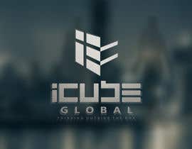
Re-create Company Logo and Brand Logo - define corporate/brand color schemes
- Status: Closed
- Hadiah: $490
- Entri Diterima: 9
- Pemenang: dimitarstoykov

Deskripsi Kontes
***VERY IMPORTANT, PLEASE NOTE**** IDEALLY A LOGO DESIGN USING NEGATIVE SPACE - for some examples go to the following website...
http://www.boredpanda.com/negative-space-logos/
Corporate Logo:
I Cube Global Corp is a product & service supplier focusing mostly on the Construction Industry - our major focus is the supply of Heavy Machinery and other Construction goods/services. I've attached a copy of our old logo and examples of how it was used on our business cards - company slogan is "thinking outside the box" and open to suggestions - I've attached "logo-idea.jpg" as reference of one logo that actually looks decent, but we're looking for something even better - please try to include the slogan "thinking outside the box" in the "I Cube Global Corp" Corporate logo....
Cube Test:
We Manufacture our own brand of "Material Testing Lab Equipment" under two sub-brands through manufacturing partners, "Cube Test Value" and "Cube Test Premium" - I've attached a copy of our old "Cube Test Value" logo - we'd like the logos to be related to the corporate logo "I Cube Global Corp" - also not a necessity but if possible, we'd like to somehow incorporate something along the lines of "Canadian Quality Solutions" or somehow identify that it is a "Canadian Product" in the brand logo - if not possible this is not essential. Also the two sub-brands should have two different color schemes to differentiate them. For an Idea of the type of Machinery we will be branding with these logos I've attached some example photos, instead of "Besmak" or "Protherm" we will be using "Cube Test Value" or "... Premium".
****PLEASE NOTE - DO NOT PLACE "CANADIAN QUALITY SOLUTIONS" IF YOU CAN'T FIND A CREATIVE WAY TO DO IT - IT'S NOT IMPORTANT, THE LOGO NEEDS TO BE SIMPLE WITH MINIMAL WRITING*****
"Cube Test" on Scale:
I've also attached a photo of a scale that we are branding as "Cube Scale" - I would like to get suggestions of designs for the "LCD Panel" of the Scale so that we can use our own branding on the scale - I've attached photos of the Scale's LCD panel and image of the actual scale - this will be branded with our brand instead though, design needs to be entirely different.
What our logo should represent:
There are many ideas we've got, and we simply haven't been able to work with a designer who's creative enough, we'd like something creative (out of the ordinary), simple, elegant, powerful - we'd like to effectively communicate through our logos that we are a large powerful group...
We'd also like a logo that can be applied anywhere in terms of design/colors - either two contrasts to be placed on dark/light backgrounds... or a "framed logo" which has it's own background and has no issues being applied anywhere.
Keahlian yang Disarankan
Umpan balik Pemberi kerja
“I doubt you can find a better designer, easy to communicate with, goes above and beyond to get what you want, even after the closing of the contest he was still working with us to get us what we want. Extremely creative, some designers simply get lucky - while others are articstic and unique in every design they submit. Certainly Dimitrov is one of those special cases. We look forward to working with him some more int he future.”
![]() icglobal, Iraq.
icglobal, Iraq.
Papan Klarifikasi Publik
-

shehan19915
- 10 tahun yang lalu
Congratz dimitarstoykov
- 10 tahun yang lalu
-

Penyelenggara Kontes - 10 tahun yang lalu
#277 - certainly in the right direction, but the scale faceplate really needs to be redone completely - I don't want it to be related to the old design in any way what so ever (even the button shapes, colors and designs should be changed...)
As for the "CUBE TEST" I'm interested in seeing more creative concepts in that, thank you and look forward to see more good work from you.- 10 tahun yang lalu
Lihat 2 lebih banyak pesan
-
Imbuewith
- 10 tahun yang lalu
missed :(
- 10 tahun yang lalu
-

vinayvijayan
- 10 tahun yang lalu
please consider #285
Thanks- 10 tahun yang lalu
-
Penyelenggara Kontes - 10 tahun yang lalu
#241 - would be interested in seeing your "Cubetest Logo" and "machinery sticker concepts" also your scale face plate.
- 10 tahun yang lalu
-

trying2w
- 10 tahun yang lalu
Kindly check #277.....Thanks...!!!
- 10 tahun yang lalu
-

galihgasendra
- 10 tahun yang lalu
Please check my simple design ^_^
Hope U like it ^_^ #266 #267 #268 #269 #270 #271 #272 #273 #274- 10 tahun yang lalu
-
galihgasendra
- 10 tahun yang lalu
Trying Hard,, #275 #276
- 10 tahun yang lalu
-
Penyelenggara Kontes - 10 tahun yang lalu
Your efforts are much appreciated... I think you need to focus a bit to make the design a bit more unique and subtle in the sense that the image does not literally need to show an "I" and a "Cube" - if you pay attention to some of the designs you will realize you have to look closely to notice the logo's hidden "I" and "Cube" for example; thanks for your hard work, you have the vision and hope you do get there...
- 10 tahun yang lalu
-

Emanuella13
- 10 tahun yang lalu
hello, just wanna know if it has any point in continuing with the entry #203 ?
- 10 tahun yang lalu
-
Penyelenggara Kontes - 10 tahun yang lalu
#203 - we reduced star ratings on some not because we don't like them anymore, but to clarify which are our top selection, which our secondary.. and which our third - yours is in third. we've gotten some interesting submissions which have pushed to the top, your design will need to give more of a message or change in order to go to 1st or 2nd - It is an amazing design, but they just keep getting better and others are more suitable to what we're looking for.
- 10 tahun yang lalu
-
Penyelenggara Kontes - 10 tahun yang lalu
#262 - the concept is certainly interesting... but you've simply put the logo on the screen... I'm looking for the entire face plate to be changed... different design pattern, different color selection, etc... I want the scale design to make it look much different than the original and give it some edge... thanks for the efforts and look forward to seeing more from you...
- 10 tahun yang lalu
-

reynold1221
- 10 tahun yang lalu
@icglobal...is it ok? let me know!
- 10 tahun yang lalu
-

LouieJayO
- 10 tahun yang lalu
Hello icglobal, which should be followed? "i3" or "iCube"?
- 10 tahun yang lalu
-
Penyelenggara Kontes - 10 tahun yang lalu
we're liking i3 concept more... but you gotta really be creative and do something that has a suitable msg for our corp
- 10 tahun yang lalu
-
vinayvijayan
- 10 tahun yang lalu
Hi,
Kindly check #257
Thanks- 10 tahun yang lalu
-
Penyelenggara Kontes - 10 tahun yang lalu
#253 - in your "CUBE-TEST" design you will need to drop the "i" before "Cube"... i think, the others didn't simply because the "I" is a part of the logo image rather than something simply written out... Also it needs to say "CUBE TEST"
- 10 tahun yang lalu
-
mariadesigns78
- 10 tahun yang lalu
Thanks for your suggestions. Please check #255. Thanks
- 10 tahun yang lalu
-
Penyelenggara Kontes - 10 tahun yang lalu
I need the "Cube Test" logo to be very similar to the "I CUBE" so that it's clear one is the brand, the other is the corporate entity, thanks and sorry for trouble ;)
- 10 tahun yang lalu
-
Penyelenggara Kontes - 10 tahun yang lalu
****Just a notice for our top selections, the "CUBE TEST" and "CUBE SCALE" are two different sub-brands... it's not "CUBE-TEST-SCALE". The CUBE SCALE brand doesn't have "Value/Premium" also, can we focus on designing a nice face-plate for our scale that can be applied on almost any scale size? The scale face-plate I've attached can be changed entirely (buttons, background design/colors/etc i want something that makes our product look unique and out of the ordinary - I look forward to seeing your submissions.
- 10 tahun yang lalu
-

rogeliobello
- 10 tahun yang lalu
#249, Simple Design... Thanks
- 10 tahun yang lalu
-
Penyelenggara Kontes - 10 tahun yang lalu
very nice, but it's not in the direction of our corporate image, keep trying you seem to have great potential.
- 10 tahun yang lalu
-
vinayvijayan
- 10 tahun yang lalu
Hi,
Please check #245
Thanks- 10 tahun yang lalu
-
Penyelenggara Kontes - 10 tahun yang lalu
#234 very nice, very simple amazing; but you'll need some more modification to perfect, needs to communicate a bit more of a message...
Maybe write "I CUBE GLOBAL" in writing under the logo as well as an alternative?- 10 tahun yang lalu
-
trying2w
- 10 tahun yang lalu
Thanks for your feedback...Kindly check my new submission #241 ....
Regards...- 10 tahun yang lalu
-
Penyelenggara Kontes - 10 tahun yang lalu
amazing work is all i can say - to put it simply, I will meet with my colleagues tomorrow to get their feedback as well... certainly yours is among the top 3 designs... keep going and lets see where this can go
- 10 tahun yang lalu
-
Penyelenggara Kontes - 10 tahun yang lalu
just a notice for everyone, we've guaranteed the payment now that we have some concepts we are confident we can work with, good luck to everyone.... but we are on the verge of making a decision...
- 10 tahun yang lalu
-
AlphaCeph
- 10 tahun yang lalu
#228.. Hope you like it.. Please Consider & Feedback..Thanks
- 10 tahun yang lalu
-
Penyelenggara Kontes - 10 tahun yang lalu
interesting concept, but not what we're looking for, we need something more subtle
- 10 tahun yang lalu
-
BlackFlame10
- 10 tahun yang lalu
please rate #233 and give feedback,, thank you
- 10 tahun yang lalu
-
Penyelenggara Kontes - 10 tahun yang lalu
sorry not in the direction of what we're looking for, the design is completely off - but please keep trying
- 10 tahun yang lalu
-

BrandCreativ3
- 10 tahun yang lalu
Review # 227
Many thanks- 10 tahun yang lalu
-
Penyelenggara Kontes - 10 tahun yang lalu
to summarize one by one... #187 - I really like where you've taken this, good use of negative space, two issues are the image spells out IC3, we want i3G or i3Global or just i3 - also, the written font will need to change... and the imagery font is too bubbly - but i really like the edge you've put to it and hope to see more from you
- 10 tahun yang lalu
-
shehan19915
- 10 tahun yang lalu
Sure sir, Working for an inspiration, Thank you for your consideration. : )
- 10 tahun yang lalu
-
shehan19915
- 10 tahun yang lalu
Hi, Please rate and review #225
- 10 tahun yang lalu
-
Penyelenggara Kontes - 10 tahun yang lalu
We're quite close to awarding the competition, so to everyone with a top design that you feel is in it's final touches, can we start submitting the same design with the "CUBE TEST VALUE" or "3Test VALUE" or "i3Test Value" (depending on how your design was done) - please note we are not looking for new logos... we prefer using the same imagery for our corporate logo and our machinery logo. We also have "Cube Test Premium" in the same variations. Last thing, a design for "CUBE SCALE" or "i3Scale" or "3Scale" depending on your current designs as well along with the LCD face of the Scale that we've attached to the original briefing... as I said we all feel we're almost ready to reward this one and hope we haven't offended anyone, we thank everyone for all the hard work and encourage you to do some more....
- 10 tahun yang lalu
-
Penyelenggara Kontes - 10 tahun yang lalu
just a thought, on the CUBE TEST range... can we put "Canadian Quality Solutions" instead of the "thinking outside the box"? I think that may work well too... but just a thought - some designs don't have the slogan and a slogan may ruin them, so please understand we are flexible and listen to suggestions, so there is no script that must be followed you can submit without the "Canadian Quality Solutions" or "thinking outside the box" ;)
- 10 tahun yang lalu
-
mariadesigns78
- 10 tahun yang lalu
Any suggestion on # 107. Thanks
- 10 tahun yang lalu
-
Penyelenggara Kontes - 10 tahun yang lalu
I really like it, try to modify a bit here and there maybe? the ones I can't make suggestions can be further developed certainly - it's just reached beyond my creative ability as they are nearly perfect in their take of a concept and with very little room for improvement, take it on yourself and get creative with it....
- 10 tahun yang lalu
-
Penyelenggara Kontes - 10 tahun yang lalu
#202 - you've done it right by following the adjustments I suggested, your design's certainly in the right direction - can we see further developments on the graphic elements on this, another one of those really good concept that can inspire into a winning logo. Try to work around with it... I told you earlier to switch the "CUBE" righting to "GLOBAL" - maybe we can stick with the same imagery but add "I CUBE GLOBAL" in neat writing next to it or under, this will make the logo more readable and understandable... Again thank you and everyone else for all the hard work, keep going; we're getting real close now and we're starting to really like the designs we've narrowed down to
- 10 tahun yang lalu
-
Penyelenggara Kontes - 10 tahun yang lalu
#187 - please focus on this concept, it's a really nice idea... you just gotta take it a bit further with further developing the graphic design of the image - another one of the "best concepts" but it needs stronger graphic/design elements (touch-ups). Again you've also been working with us for a few days and really hard and we all do certainly appreciate it - keep going and best of luck.
- 10 tahun yang lalu
-
Penyelenggara Kontes - 10 tahun yang lalu
#192 - this is so far the best one; work a bit on the font/look of the big "I" - it's a real nice concept; you have really nice and original ideas - certainly among the best in the group; it's just the design touch-ups need some more work and certainly the design will get to a 5-star. Keep trying and as I said, use the #192 design to take it further in it's looks, etc.... / #198 - I love the concept of the "I" and "3" both being in one image... but the image also needs some tweaking to get there, if you can improve on the graphics design itself I see these making it to the top - best of luck and thanks for all your hard work with us :)
- 10 tahun yang lalu
-
Penyelenggara Kontes - 10 tahun yang lalu
#201 - I like some things about this... but it's a bit difficult to understand - the design is certainly interesting and inspiring, could potentially lead you to making something that can take the competition... keep trying and good work to you and everyone else that's been working real hard on this
- 10 tahun yang lalu
-
Penyelenggara Kontes - 10 tahun yang lalu
#213 - we all love it, among the best contestants so far - amazing work in all honesty... if you can make other proposals as well would be interesting, otherwise I don't know how we can further improve this, we like everything in it so far... but there is one that only beats it in the message/use of negative space... but certainly one of the few we are already considering to reward....
- 10 tahun yang lalu
-
AlphaCeph
- 10 tahun yang lalu
#211.. & #212.. New Concepts. Hope you like it.. Please Consider & Feedback..Thanks
- 10 tahun yang lalu
-
Penyelenggara Kontes - 10 tahun yang lalu
really like #211 - work a bit on the fond though and the colors as well.. more subtle colors - also the font needs to be more corporate looking, less bubbly; but really nice design and I can see it's certainly in the right direction
- 10 tahun yang lalu
-

baiticheramzi19
- 10 tahun yang lalu
please check PM, thanks
- 10 tahun yang lalu
-
baiticheramzi19
- 10 tahun yang lalu
!!!!!!!!!!!!!!!!
- 10 tahun yang lalu
Bagaimana untuk memulai sebuah kontes
-

Buat Kontes Anda Cepat dan mudah
-

Dapatkan Jutaan Entri Dari seluruh dunia
-

Pilih entri terbaik Unggah file - Mudah!