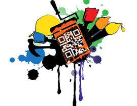
QR Code Logo for Freelancer
- Status: Closed
- Hadiah: £54
- Entri Diterima: 20
- Pemenang: nicoscr
Deskripsi Kontes
I require a logo which encorporates a QR code. On scanning, the QR code should direct users to a website. (Any search engine can direct you to a QR code generator).
The logo is for a freelancer who will use it as branding on their USB flash drives, business cards etc. Therefore the logo should not be too imposing (no one wants to own a USB drive with a logo which is clearly someone else's branding, so perhaps something a little subtle and stylish would be best).
The logo design may wish to encorporate tools of the freelancer's trade (paint brushes, hammers, measuring rule). It should display a sophisticated, arty and fun personality type.
Examples of other QR code logos:
http://advancedtele.com/wp-content/uploads/2012/02/sharks-qr-code.jpg
http://www.eileenlonergan.com/wp-content/uploads/2011/08/QR-codes-gallery-298x300.jpg
It would be great if the logo suited being part of the QR code and also looked good as a standalone logo without the QR code - for example, one could remove the QR code from the above Sharks logo and it would still look good as a standalone logo.
Please see attachment for further details.
Keahlian yang Disarankan
Umpan balik Pemberi kerja
“A brilliant freelancer! I get the impression that this guy totally underestimates his abilities. He is extremely talented and works at a lightning fast pace. I awarded him the contest as his design was spectacular and during the handover stage he provided me with plenty of revisions and even offered other ideas. I really felt as though he went out of his way to make the design exactly as I wanted it and he always just seemed happy to be utilising his creative abilities. I highly recommend nicoscr's services and I hope to work with him again in the future. 10/10!”
![]() GigaBowser, United Kingdom.
GigaBowser, United Kingdom.
Papan Klarifikasi Publik
-

csirmazandras
- 11 tahun yang lalu
First thing in the morning: new fonts as requested with the brush more involved: #77 and #78 . Thank you for your feedback!
- 11 tahun yang lalu
-

csirmazandras
- 11 tahun yang lalu
Thanks for the 5 star rating! :)
I'm on the road logging in with my iPad, so I can't access my home computer with the designs on it, but as I said I can change colors, sizes, (the font if you wish) and the position of the logo relative to the QR code. If you want I can even change the circles to hearts or some other shapes, but I won't be able to submit any more designs before the deadline, because I'm on my iPad. With that said, I hope you like what I had to offer during this contest and you are satisfied with the designs I submitted.
Before you select a winner pease make sure the code scans properly! Not all of the submitted ones do!
Thank you!- 11 tahun yang lalu
-

csirmazandras
- 11 tahun yang lalu
New logo with new font and a brush more incorporated into the design: #74
- 11 tahun yang lalu
-

csirmazandras
- 11 tahun yang lalu
#67 is a new approach with a more creative QR code This makes it more fun, even if it is on a marketing material, like a flash drive. Actually it can be used as an icebreaker because of the unusual form. This entry is made of three slightly different designs, please check them all out and give some feedback!
I appreciate it! :)
P.S.: all three codes scan effortlessly, despite the circle design ;)- 11 tahun yang lalu
-

Penyelenggara Kontes - 11 tahun yang lalu
It's an exciting new approach, but I don't think the QR code matches well with the initials/logo design. The circles are clever but they just don't really seem to match the rest. Please would you concentrate on the initials/logo design as it doesn't look so good freestanding by itself. Maybe positioning the paint brush near to the 'j' or perhaps the letters wrapped around it, so it's more incorporated, or just somehow make it all feel as one.
- 11 tahun yang lalu
-

csirmazandras
- 11 tahun yang lalu
I'll try a new font then ;) Working on it now!
- 11 tahun yang lalu
-

haska
- 11 tahun yang lalu
Hi,
Please check #73. Any feedback will be appreciated.- 11 tahun yang lalu
-

Penyelenggara Kontes - 11 tahun yang lalu
Really great idea! However, take the QR code away and it looks like a stamp :-/
- 11 tahun yang lalu
-

arunbluez
- 11 tahun yang lalu
I would like to point the contest holder that entries #62 #37 have QR code which are not readable. Respective designers kindly make it readable
- 11 tahun yang lalu
-

csirmazandras
- 11 tahun yang lalu
Submitted two additional entries ( #33 and #34 ). Please check them and give some feedback! Thanks! :)
- 11 tahun yang lalu
Lihat 2 lebih banyak pesan
-

Penyelenggara Kontes - 11 tahun yang lalu
Without the QR code it still looks a bit out of place. Could you perhaps try it at a different angle? For example, behind the text.
- 11 tahun yang lalu
-

csirmazandras
- 11 tahun yang lalu
Sure, no problem :) My only concern is, that it is not easy to produce a design where the text occupies some space from the QR code, because it makes scanning impossible very quickly. I'll get back to it regardless, I like a good challenge :)
- 11 tahun yang lalu
-

Penyelenggara Kontes - 11 tahun yang lalu
#50 - The font is a little bit too 'graffiti' style. Could we please try it with something else.
- 11 tahun yang lalu
-

Penyelenggara Kontes - 11 tahun yang lalu
#47, #48, #49, #51, #52, #53 - I would rather see the QR code in black with the logo design in a single/duo block colour. I also worry that the QR code will struggle to scan.
- 11 tahun yang lalu
-

arunbluez
- 11 tahun yang lalu
The QR code should be readable right? please check out my entry #39 , Thanks
- 11 tahun yang lalu
-

Penyelenggara Kontes - 11 tahun yang lalu
Yes, please. I would really like the QR code to be readable.
- 11 tahun yang lalu
-

nicoscr
- 11 tahun yang lalu
see my new entry #35 please. How do you find it?
- 11 tahun yang lalu
-

Penyelenggara Kontes - 11 tahun yang lalu
The font for #35 is too obvious. I still really like #18 , but it just isn't quite right yet for what I'm after. Please would you try keeping the QR code and roller (and maybe some tools - preferably the hammer) and somehow incorporate SJS initials in there somewhere - perhaps somehow incorporate the initials into the QR code so when the QR code is removed, the initials are still there.
- 11 tahun yang lalu
-

Penyelenggara Kontes - 11 tahun yang lalu
#38 - This looks great, but the colours aren't right (camo just isn't suitable). Also, I cannot visualise how a QR code would be included.
#36, #37 - I really love this design. I prefer the font of #37 than of #36 as it is too fine. Could I see #37 in a colour other than green and #36 in a thicker similarly delicate font?
#33 , #34 - I worry that when the QR code is removed, the paintbrush sticks out too far.- 11 tahun yang lalu
-

Penyelenggara Kontes - 11 tahun yang lalu
#43, #44 - Too blocky
#42 - I like the notepad idea but it's too bold. I would prefer something more fine/delicate.
#41 - It's close to the specification but for some reason it just doesn't work for me.
#39 , #40 - I feel like I'm being seduced by colours but would prefer less colours to be used. The designs are so close to perfection, but there's nothing there that really clarifies the occupation (tools etc).- 11 tahun yang lalu
-

LuchianTeodor
- 11 tahun yang lalu
Hi. Please check and rate #41
- 11 tahun yang lalu
-

Penyelenggara Kontes - 11 tahun yang lalu
#20 - I really love the idea of the initials being hidden within a logo; but, there is a swastika feel to it which isn't preferable. Although visually pleasing, the paint background of the design may be too complex for engraving etc.
#19 - Too cluttered. Much prefer #18 .- 11 tahun yang lalu
-

csirmazandras
- 11 tahun yang lalu
Let me try a slightly different design :)
- 11 tahun yang lalu
-

Penyelenggara Kontes - 11 tahun yang lalu
Bits I really like:
Initials being combined to create a logo (#20)
Feminine (yet still readable) initials (#28). Would be nice to see the brush incorporated/closer to the initials design.
I like it when everything is combined in one place ( #16 , #3, #13).
I like that the QR code and the initials are interchangeable (#13)
I like how #12 has a sophisticated/refined feel about it.
I really like #18 has included so many different tools and the roller paint bit is fantastic. I think maybe there are too many colours and when the QR code is removed, there's no personal SJS branding to it. But I really like it and where it could go.- 11 tahun yang lalu
-

Penyelenggara Kontes - 11 tahun yang lalu
#31 - I really like this; but not the colours. The initials at the bottom are pretty much what I'm after and I love how it can adapt into #28
#24 - It's a box again! I feel as though #3 and #13 are so close to working but #24 is further out. I do like how the design works with QR code and logo though.
#23 - The sticker idea is just too clinical/clean. I prefer #22 to #21 as it seems more free/rough/less-constrained, but it's verging on Dexter(!).- 11 tahun yang lalu
-

Penyelenggara Kontes - 11 tahun yang lalu
#10, #11, #14, #17 - I like how the logos can be used with and without the QR code, but I don't like how it seems so blocked in and square. I want it to portray more 'freedom' with curves.
#12 - I really like this. It's very simple but just has this classy feel to it. I don't want a name on it (as I don't think anyone would want to own a USB flash drive with someone else's name on), but I think I could get away with initials if they're merged within a design. I also worry that if the QR code is removed, there isn't much left as a stand-alone logo.- 11 tahun yang lalu
-

csirmazandras
- 11 tahun yang lalu
Thank you for the detailed review! Helps a lot! I'll try to come up with a solution to solve the problems you mentioned.
You want the initials "SJS" incorporated in the design, or just "SS"?
Thanks again!- 11 tahun yang lalu
-

Penyelenggara Kontes - 11 tahun yang lalu
I would prefer SJS, but SS would be okay if you can make it work :-)
- 11 tahun yang lalu
-

Penyelenggara Kontes - 11 tahun yang lalu
#13 - I like it but I don't think it's putting across the image I would like to portray. It feels quite masculine and I wonder if this may be due to the box/square shape. I really like how the design works with both the QR code and the initials by themselves.
#15 - A very good design and I can really see a company using this, but it feels too clinical for an artist (it would suit Audi well).
#16 - I really like this! I'm not keen on the font, but the idea itself is brilliant. It just seems so care-free and I like it.
#18 - This is very good! But if it were in a single colour (for example, if it were to be engraved or carved into wood), I don't think it will maintain its good look. Again, I really like the care-free attitude it seems to portray. I wonder how the logo would look if the QR code were to be removed for some applications.- 11 tahun yang lalu
-

Penyelenggara Kontes - 11 tahun yang lalu
#3 is on the right track, but I would prefer a more sophisticated/professional style; for example, the paint brush should look more like http://www.featurepics.com/FI/Thumb300/20101205/Paintbrush-1724418.jpg and less like http://i.istockimg.com/file_thumbview_approve/6735673/2/stock-illustration-6735673-paint-brush.jpg
#5, #6. #8 are too colourful and therefore denote children's activities. With #5 you've definitely understood my desire to incorporate tools with additional decoration. I would like more emphasis on the initials and the design may be used in black and white, therefore multiple paintbrushes may be redundant. With #8 I like how the QR code separates from the logo, however I feel the design is too masculine. Perhaps some kind of swirly decoration will push a more feminine style.- 11 tahun yang lalu
-

Penyelenggara Kontes - 11 tahun yang lalu
I take it back: please do not make the logos 'fun' as I fear they may lose the professional style I desire.
The design should consist of a QR code incorporating an SJS logo (or similar personal branding). As the QR code can still be scanned with parts removed, it would be good to perhaps sit a logo inside the QR code and place complementary decoration around the code; so the QR code can be removed and the logo (SJS, etc) can be used standalone when the barcode is not needed.
I imagine this sort of design, but also incorporating a QR code.
http://foreverlogos.files.wordpress.com/2010/11/nicole.png
The swirls could perhaps have a paint brush beside so it looks as though they had been painted; or instead of swirls, there could be tools of the trade (paint brush, saw, drill, wrench, rule, hammer, welder, planks of wood, clay, etc). This is just an idea though and I encourage creative designs.- 11 tahun yang lalu
-

ProDarell
- 11 tahun yang lalu
Any feedback would be greatly appreciated. #5 #6 #8
- 11 tahun yang lalu
Bagaimana untuk memulai sebuah kontes
-

Buat Kontes Anda Cepat dan mudah
-

Dapatkan Jutaan Entri Dari seluruh dunia
-

Pilih entri terbaik Unggah file - Mudah!

