Freelancer:
Onlynisme
Revision 3
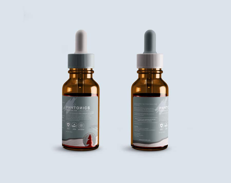
For this time, I added 2 layers of color and pattern on bottom (it used to be 3 layers, but I make it 2 so the design won't be so crowded on bottom while it has diecut logo there). Also I adjusted the color a little brighter so it won't be masculine. And for the tip, I put 2 option there for you to see. In my opinion the left one is better, blue steel lid with dusty tip. But I don't know if the product will be used for long period, so we should think about the color of the tip maybe get dirty by time (in this condition, the right one is better choice because it has dark tip color). I wait for further feedback, thank you.


