Logo Design for Asynx Software Inc
- Status: Closed
- Hadiah: $290
- Entri Diterima: 18
- Pemenang: maidenbrands

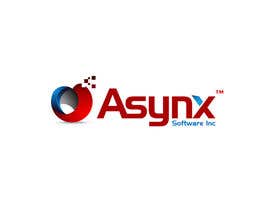
Deskripsi Kontes
Innovative software company
Keahlian yang Disarankan
Umpan balik Pemberi kerja
“Maidenbrands is a true artist and perfect designer. When I saw the logo the first time, I immediatly knew that it will be it. Thank you !”
![]() asynx, United States.
asynx, United States.
Papan Klarifikasi Publik
-

vaanigraphic
- 12 tahun yang lalu
:) #154
- 12 tahun yang lalu
-
vaanigraphic
- 12 tahun yang lalu
- 12 tahun yang lalu
-
vaanigraphic
- 12 tahun yang lalu
#153 many more style change :) ck this
- 12 tahun yang lalu
-

Clarify
- 12 tahun yang lalu
congrats maiden well done
- 12 tahun yang lalu
-

maidenbrands
- 12 tahun yang lalu
thanks mate :)
- 12 tahun yang lalu
-

hungdesign
- 12 tahun yang lalu
Please check #152
- 12 tahun yang lalu
-

HAROON1111
- 12 tahun yang lalu
plz check
#151
thnx...- 12 tahun yang lalu
-

daisy786
- 12 tahun yang lalu
Please check # 150
- 12 tahun yang lalu
-
daisy786
- 12 tahun yang lalu
Please check # 149
- 12 tahun yang lalu
-
safi97
- 12 tahun yang lalu
Please check #132 and feedback me sir.
- 12 tahun yang lalu
-

lugas
- 12 tahun yang lalu
Hey, @patrickpamittan GOOD LUCK!
#49 http://www.freelancer.com/contest/Logo-Design-for-Anetech-6851-byentry-568844.html- 12 tahun yang lalu
Lihat 4 lebih banyak pesan
-
lugas
- 12 tahun yang lalu
@patrickpamittan, Why didn't you explain that to Contest Holder of Asynx Software Logo Contest? You WERE on top entries! Better, get a letter "A" design collection and submit them in this contest :) And why jealousy? I respect ALL here... So, I suggest you to give respect in EVERY contest you participate!
Hope you will win all the contest :)
PEACE!- 12 tahun yang lalu
-

patrickpamittan
- 12 tahun yang lalu
THINK before you POST :)
- 12 tahun yang lalu
-

khurramjaved80
- 12 tahun yang lalu
Hi CH plz check PM
thanks- 12 tahun yang lalu
-
khurramjaved80
- 12 tahun yang lalu
http://www.google.com.pk/imgres?imgurl=http://www.themarketers.in/wp-content/uploads/2010/12/airtel-logo-1.jpg&imgrefurl=http://www.themarketers.in/airtel-rebranding-why-on-earth/&usg=__fzwUl-UEJgqlsqsmxlqqfnJsi5k=&h=269&w=251&sz=11&hl=en&start=7&zoom=1&tbnid=uAl7RNQqJtcwsM:&tbnh=113&tbnw=105&ei=GuutT9mdFdDIrQellN3mAw&prev=/search%3Fq%3Dairtel%2Blogo%26hl%3Den%26sa%3DX%26biw%3D1266%26bih%3D862%26tbm%3Disch%26prmd%3Dimvnsz&itbs=1
- 12 tahun yang lalu
-
patrickpamittan
- 12 tahun yang lalu
@lugas #49 http://www.freelancer.com/contest/Logo-Design-for-Anetech-6851-byentry-568844.html. The link you provided is my entry. I'ts alright to put the same entry on the same contest as long as it is not yet declared as winner So what's your point? I will withdraw it because of your jealousy. Good luck on your enties. Hope you will win all the contest :)
- 12 tahun yang lalu
-
patrickpamittan
- 12 tahun yang lalu
God Bless:)
- 12 tahun yang lalu
-

sjsrikanth
- 12 tahun yang lalu
Please check ..and suggest changes #125
- 12 tahun yang lalu
-
vaanigraphic
- 12 tahun yang lalu
#121 #122 plz feeback
- 12 tahun yang lalu
-
vaanigraphic
- 12 tahun yang lalu
#108 plz feedback
- 12 tahun yang lalu
-
Penyelenggara Kontes - 12 tahun yang lalu
The blue ball could be smaller, keeping some white around it ? But I understand now that you are a true professional designer !
- 12 tahun yang lalu
-

AndrewVFX
- 12 tahun yang lalu
#115 #116 #117 ^_^
- 12 tahun yang lalu
-
AndrewVFX
- 12 tahun yang lalu
looking forward for your feedback, thanks ^_^
- 12 tahun yang lalu
-
AndrewVFX
- 12 tahun yang lalu
Very tough competition, Logos are nice here, Goodluck to all ^_^
- 12 tahun yang lalu
-
vaanigraphic
- 12 tahun yang lalu
plz feedbaack
- 12 tahun yang lalu
-
vaanigraphic
- 12 tahun yang lalu
#107 #104 #99 :)
- 12 tahun yang lalu
-
Penyelenggara Kontes - 12 tahun yang lalu
Thas gonna be a very hard descission !
- 12 tahun yang lalu
-
Clarify
- 12 tahun yang lalu
#102 :)
- 12 tahun yang lalu
-
Penyelenggara Kontes - 12 tahun yang lalu
Yeah, that look much more integratec and stylish !
- 12 tahun yang lalu
-
Clarify
- 12 tahun yang lalu
#97 thanks
- 12 tahun yang lalu
-
Penyelenggara Kontes - 12 tahun yang lalu
NICE !
- 12 tahun yang lalu
-
Penyelenggara Kontes - 12 tahun yang lalu
#95, maybe the red logo to the left of Asynx, I like the shape !
- 12 tahun yang lalu
-
hungdesign
- 12 tahun yang lalu
i want u check #85, thanks
- 12 tahun yang lalu
-
Penyelenggara Kontes - 12 tahun yang lalu
Not bad, I like it.
- 12 tahun yang lalu
-
hungdesign
- 12 tahun yang lalu
thanks CH
- 12 tahun yang lalu
-
Clarify
- 12 tahun yang lalu
#82 and #81 thanks
- 12 tahun yang lalu
-
Penyelenggara Kontes - 12 tahun yang lalu
I like #31 for its simplicety and futuristic design. The "x" at the end should just be the letter "x" and no box around it.
On #1, I like that the logo itself can also be used without the Text. #12 is also good because the style is constant.- 12 tahun yang lalu
-

evoss
- 12 tahun yang lalu
Hi! Thanks for your comment on my #31 . I ensure you it's really good without the box also! I will post again so you can see it.
- 12 tahun yang lalu
-
Penyelenggara Kontes - 12 tahun yang lalu
Thank you, I like the new version. I knew it also looks good without.
- 12 tahun yang lalu
-
Penyelenggara Kontes - 12 tahun yang lalu
#72 just blew me away, it is exactly the type of design I like. It conatains all elements I was looking for.
- 12 tahun yang lalu
-
Clarify
- 12 tahun yang lalu
@ajoodesigner don't copy AkashBro design with #64 you know what i mean
- 12 tahun yang lalu
-

ajoodesigner
- 12 tahun yang lalu
My dear I know this not you can see this not as you thinking e this @ but i know that is copy from all same i have seen at 99designs :)
- 12 tahun yang lalu
-
Penyelenggara Kontes - 12 tahun yang lalu
It is not my favorite logo, I need something more compact and "quiet", this one is too "loud" for me.
- 12 tahun yang lalu
-
PlatinumStudios
- 12 tahun yang lalu
That is really sad. I dont know how many time I have seen this same A in many a contest, but it is getting old. And shame on you khurramjaved80 for submitting the same element in design #7 to another contest seen here:
http://www.freelancer.com/contest/Logo-Design-for-Allihub-6813-byentry-570147.html, http://www.freelancer.com/contest/Logo-Design-for-Allihub-6813-byentry-570151.html and http://www.freelancer.com/contest/Logo-Design-for-Allihub-6813-byentry-570155.html
It is lazy designers like this that make copyright lawyers rich.- 12 tahun yang lalu
-
Penyelenggara Kontes - 12 tahun yang lalu
OK, Thanks
- 12 tahun yang lalu
-
ajoodesigner
- 12 tahun yang lalu
Please sir #64 feedback
- 12 tahun yang lalu
-

rehanismail
- 12 tahun yang lalu
feedback for my #62 & #67 of logos...
- 12 tahun yang lalu
-
Penyelenggara Kontes - 12 tahun yang lalu
The @ is a great idea ! @synx #37. The logo is too "hard" and I dont like the font
- 12 tahun yang lalu
Bagaimana untuk memulai sebuah kontes
-

Buat Kontes Anda Cepat dan mudah
-

Dapatkan Jutaan Entri Dari seluruh dunia
-

Pilih entri terbaik Unggah file - Mudah!