Graphic Design for One page web site for the Saint Of the Internet: St. Isidore of Seville
- Status: Closed
- Hadiah: $150
- Entri Diterima: 20
- Pemenang: RockPumpkin

Deskripsi Kontes
Easy One Page web site mockup with css and html (no programming)
Keahlian yang Disarankan
Umpan balik Pemberi kerja
“overall a good experience,”
![]() whssf, United States.
whssf, United States.
Papan Klarifikasi Publik
-

Penyelenggara Kontes - 12 tahun yang lalu
Dear RockPumpkin, Art2B, and DesignSektor,
I want you to know that I believe you have all done an amazing work, and that the three designs are really good,
so it's practically "unfair" to choose a single one,
I'll be picking Pumpkin one, but again, they are all good,
and I really look forward to work with the three of you in the close future,
Thank you and best regards,
Andres- 12 tahun yang lalu
-

RockPumpkin
- 12 tahun yang lalu
Thank you so much Sir. Please wait for the final design with html and CSS...
- 12 tahun yang lalu
-

browncoder
- 12 tahun yang lalu
plz find the design no #27.Waiting for your feedback .Thanks
- 12 tahun yang lalu
-
Penyelenggara Kontes - 12 tahun yang lalu
one general comment,
I checked for the best wording instead of wish/prayer and it seems to be "implore" for the button to send the form,
and implorations for the former list of wishes/prayers,
entry 14 looks good,
the "buts" I see there are:
the background went to simplistic,
although the iPad frame is ok, the content in it is to iPad-ish, meaning very web2.0 and not to Gothic baroque or renaissance,
the entry 12 looks to "child-ish" and harry potter-ish,
we are looking more for a religious look,- 12 tahun yang lalu
-

ART2b
- 12 tahun yang lalu
- 12 tahun yang lalu
-
ART2b
- 12 tahun yang lalu
Done :)
Check #17- 12 tahun yang lalu
-
mreis1
- 12 tahun yang lalu
design almost finished
- 12 tahun yang lalu
-

joka232
- 12 tahun yang lalu
#11 thankyou
- 12 tahun yang lalu
-
RockPumpkin
- 12 tahun yang lalu
Please review #9 Thank you for the feedback
- 12 tahun yang lalu
-
Penyelenggara Kontes - 12 tahun yang lalu
entry 8 is very very good, the color palette near perfect,
the only defect it has is that the layout and boxes look "game-ish" and less like "renaissance" (which is the look we seek)
and I wonder how multi-line vs short messages will play along in the two column listing,
entry 7 is close to perfect as well, if it could only be just a bit more "renaissance" and less web 2.0 font types,
it lacks the email/twitter field as well,- 12 tahun yang lalu
-
Penyelenggara Kontes - 12 tahun yang lalu
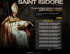
As they stand I am preffering designsektor's a bit more over mreis',
Both entries just help me realize what is that I wanted:
the full size saint image blending in the background -designsektor-
the name of the saint needs to stand out very clear -mreis-
the "all in one" functionality in the page, (no need to click to get a form) -designsektor-
more space given for the wish list -mreis-
gray background better than the yellow, although the monitor frame and margins may take to much space out of the screen for the message display
all the color themes are good,
(although I like a tid bit more the tendency to taking light out of the colors a bit more)
I just realize that in the form,
I would need a small second text field for the wisher to enter an email or twitter handle if they want to locate their wishes later,
so just a little modification adding
a little 20 char space text field probably at the same level of the submit button,
Thank you!- 12 tahun yang lalu
-
mreis1
- 12 tahun yang lalu
thanks for the feedback, i'll try something new later
- 12 tahun yang lalu
-
RockPumpkin
- 12 tahun yang lalu
Can you provide a feedback and rate my entry #7 Sir please? all of the design elements are 100% codable...
- 12 tahun yang lalu
-
RockPumpkin
- 12 tahun yang lalu
Please wait for my entry
- 12 tahun yang lalu
-
Penyelenggara Kontes - 12 tahun yang lalu
narrowing down the requirements:
dark theme preferred, (or darkened colors)
the name of the saint must appear and be clear,
full image saint blended with background at the left side,
box for the prayer, optional little text field for the email or twitter handler,
all in one page, (no click to get to the form)- 12 tahun yang lalu
-

berhoum
- 12 tahun yang lalu
see an example:
http://cutt.us/dz-I8O- 12 tahun yang lalu
-
nimeshniranjan
- 12 tahun yang lalu
hello
- 12 tahun yang lalu
-
Penyelenggara Kontes - 12 tahun yang lalu
I see civis4design entry as way to simplistic, and without any visual relationship or harmony between the five diferent elements proposed in the page,
(background, saint picture, text, input field, and text list)- 12 tahun yang lalu
-

CIVIS4DESIGN
- 12 tahun yang lalu
please try to express more
take this way by example :
background : color / use this / like this / do not ....
saint picture : ...
text ...
if you can give me the saint picture- 12 tahun yang lalu
-
CIVIS4DESIGN
- 12 tahun yang lalu
please check and review #1
could be changed and improved , thanks- 12 tahun yang lalu
Bagaimana untuk memulai sebuah kontes
-

Buat Kontes Anda Cepat dan mudah
-

Dapatkan Jutaan Entri Dari seluruh dunia
-

Pilih entri terbaik Unggah file - Mudah!