Papan Klarifikasi Publik

  • gbettencourt1
    Penyelenggara Kontes
    • 3 tahun yang lalu

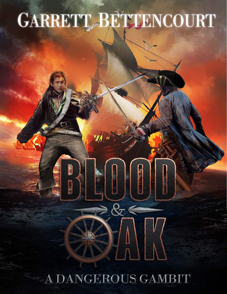
    I like the idea here, but the outer lines of the character seem to really grind against the surroundings.

    • 3 tahun yang lalu
  • gbettencourt1
    Penyelenggara Kontes
    • 3 tahun yang lalu

    Nice design, but still a little hard to see. Would need it brighter. Bolder. Visibility in thumbnail is key in book publishing.

    • 3 tahun yang lalu
  • gbettencourt1
    Penyelenggara Kontes
    • 3 tahun yang lalu

    Overall, a pretty good concept. Some of the elements still seem to clash for me or don't look as seemless as I'd like.

    • 3 tahun yang lalu